 10 years of collaboration in evolving a nostalgic brand into a digitally driven, pan-India presence.
Case study
Home appliance
Butler holds a special place in the hearts of Malayalis — a brand synonymous with childhood nostalgia for anyone who grew up in the 1990s. More than just a household name, it was a symbol of simple joys and fizzy memories. We were honoured to be part of Butler's journey as they set their sights on something bigger: transforming from Kerala's beloved soda maker into a nationally recognized brand.
As India's only homegrown soda maker manufacturer, Butler had a legacy worth celebrating — and scaling. Our role was to channel that emotional connection into a powerful digital-first strategy that could engage new-age consumers while retaining the brand's iconic charm. From refreshing their identity and packaging to crafting culturally relevant campaigns and driving e-commerce growth, we helped Butler evolve into a future-ready brand without losing sight of its roots.
Through consistent storytelling, targeted digital marketing, and strategic positioning, Butler's comeback wasn't just a revival — it became a reinvention. What started as a nostalgic drink from the past is now a bold, modern beverage for a new India.
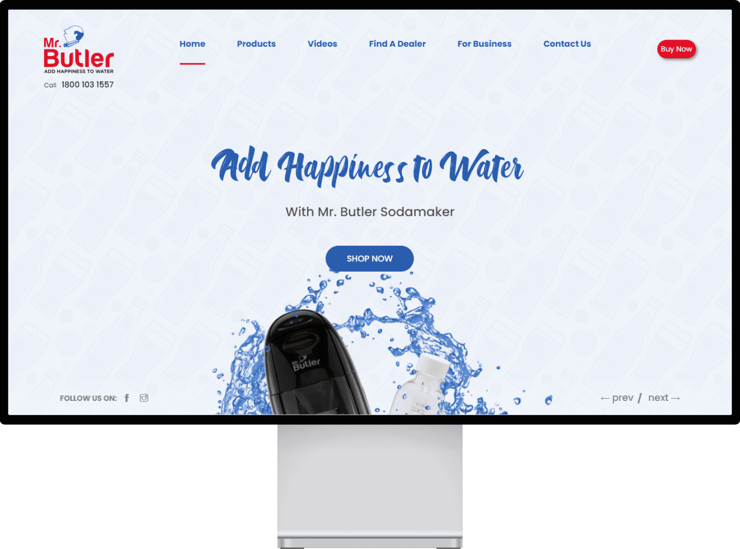

Improved user experience
Aesthetically beautiful banners, landing pages and creatives
Following proven and best practices for an ecommerce website delivering best user experience.
Higher sales and better conversions
More targeted and personalized ads.
Landing pages group individual product pages together based on a similar theme, making it easier for users to find what they are looking for. By having well-structured category pages, e-commerce brands can improve their rankings for specific keywords and make product exploration easier for consumers.
Having a landing page for every product category helps to make the website more informative and persuasive for users by highlighting the main unique selling points (USPs) of the products. This generates higher sales and better conversions as a result.
By directing users to a specific landing page, e-commerce brands can create a more targeted and personalized experience for users. This helps to increase the relevance of the ad and improve the chances of conversion. Landing pages also help to improve the quality score of ads, which can lead to lower costs per click and higher ad rankings.
Providing clear and concise product descriptions, using high-quality images, optimizing the website for mobile devices, providing add to cart and buy now options, using product cards to showcase products in a visually appealing manner, offering multiple payment gateway options, making payments easy and hassle-free, and providing cart options such as save for later or wishlist. By adopting these best practices, Mr. Butler's e-commerce website can improve the user experience, increase sales, and stay ahead of the competition.
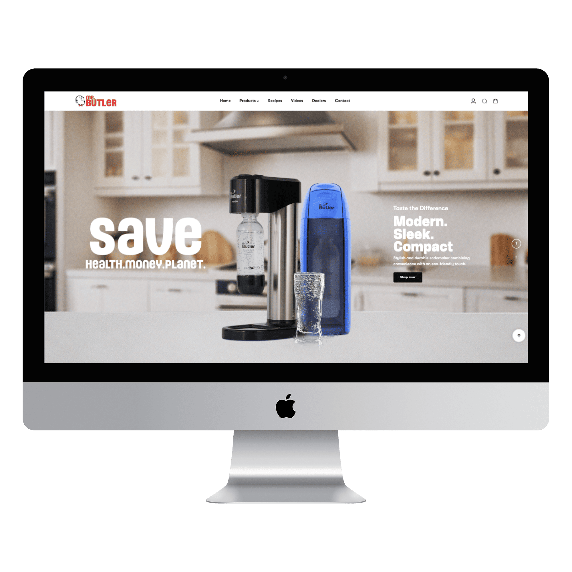
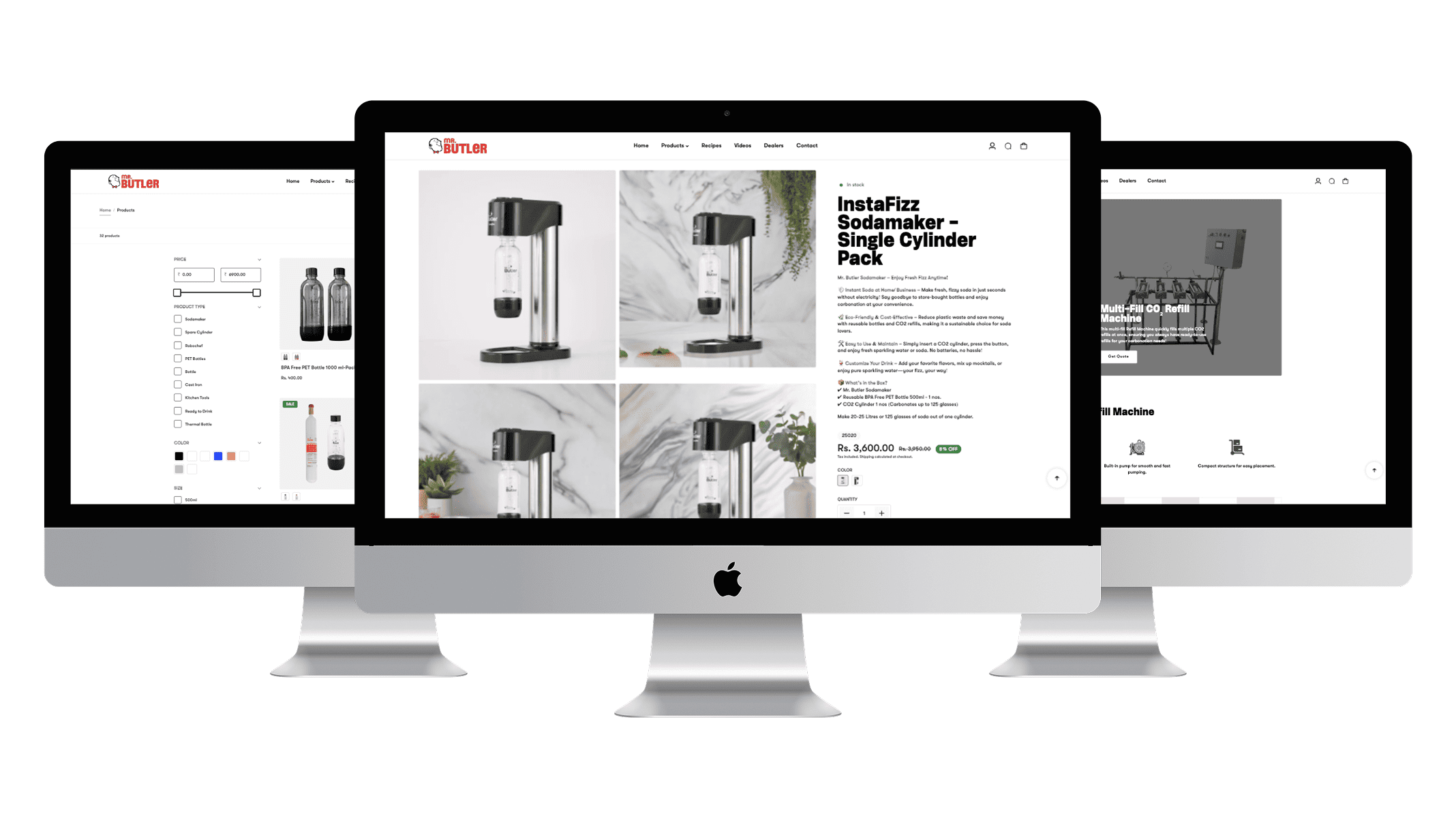
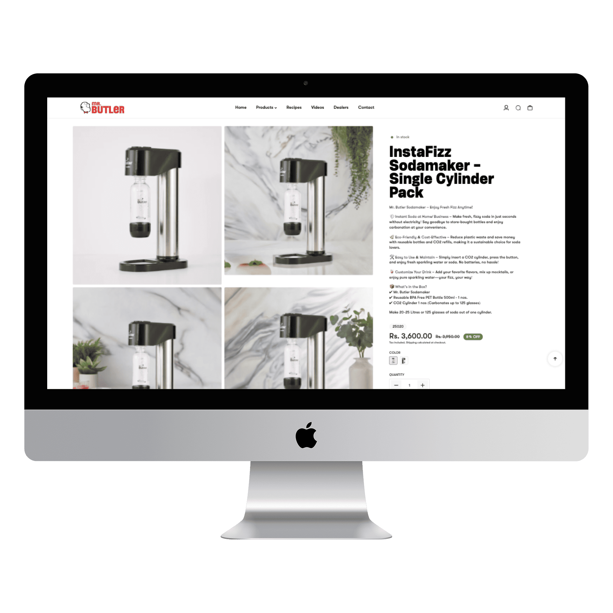
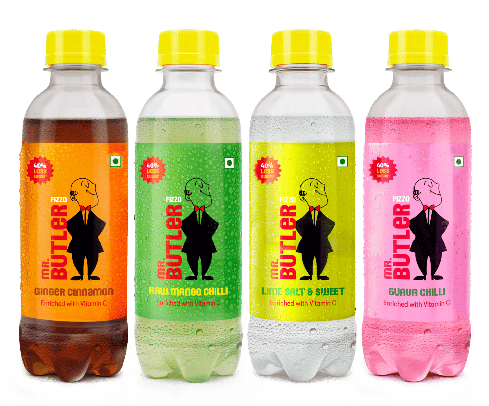
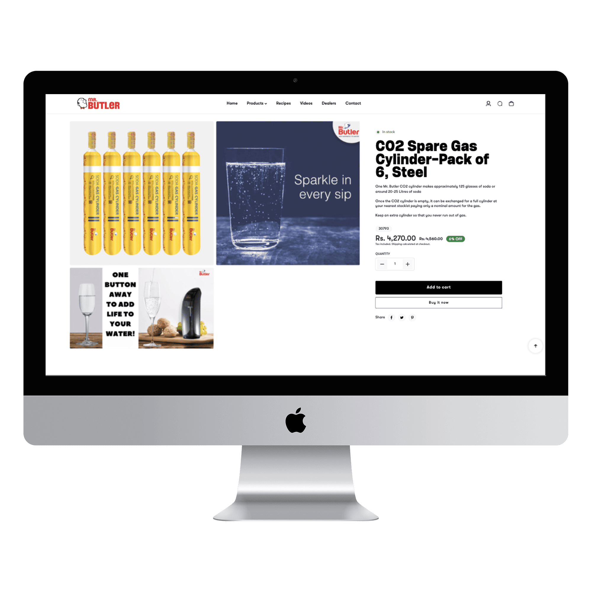
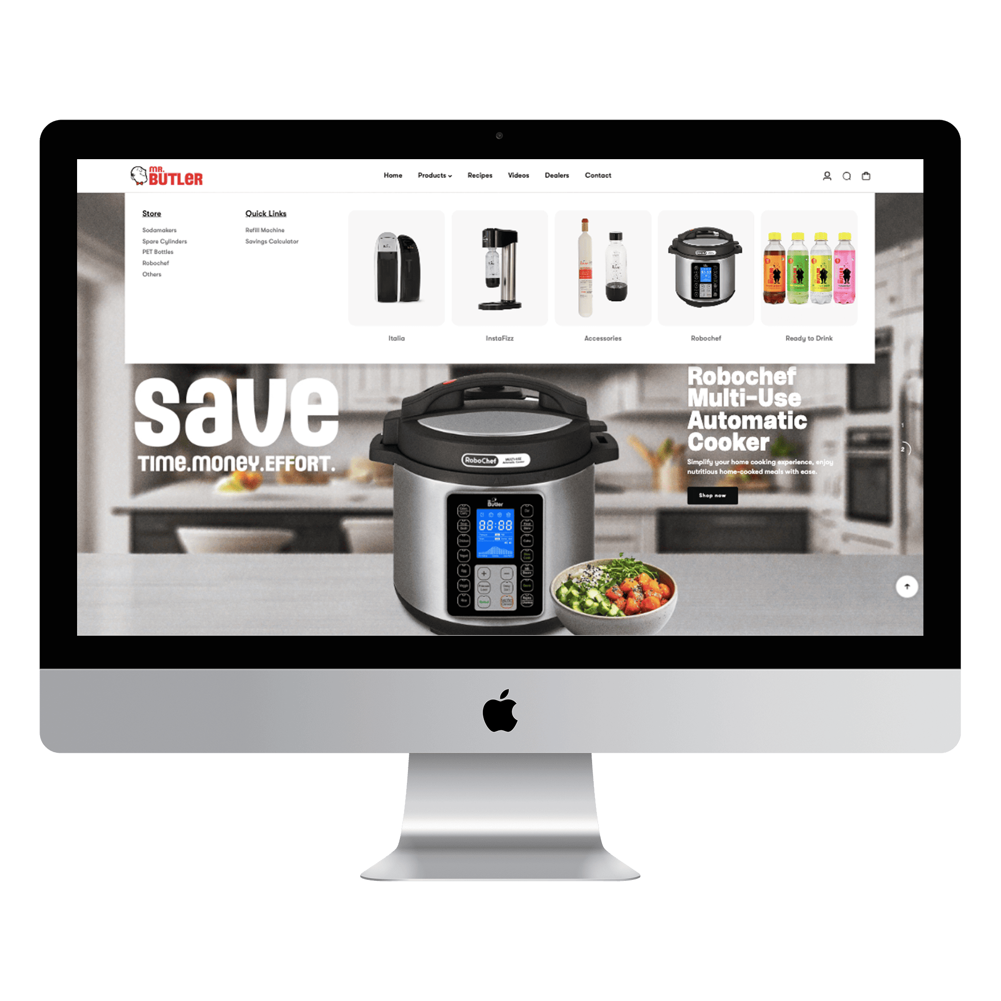
By incorporating banners on every landing page, highlighting the main unique selling points (USPs) of the sodamaker and bottles, increasing information availability, and revamping the user interface, the website has significantly improved the overall user experience.
These improvisations have not only enhanced the visual appeal of the website but also made it more informative engaging and easy to navigate for users.
The case study highlights the importance of understanding user needs and expectations while designing and developing a website. It serves as a valuable resource for future improvements and provides insights into creating a user-centric online platform.
Full-service solutions to power your brand and technology, driving growth at every stage. Get started with us