Case study
B2B Export
The current design of the Palm Fibre website presents several significant issues related to both user experience (UX) and user interface (UI). These problems detract from the overall usability, accessibility, and aesthetic appeal of the site.
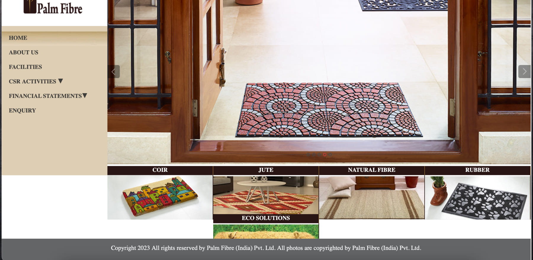
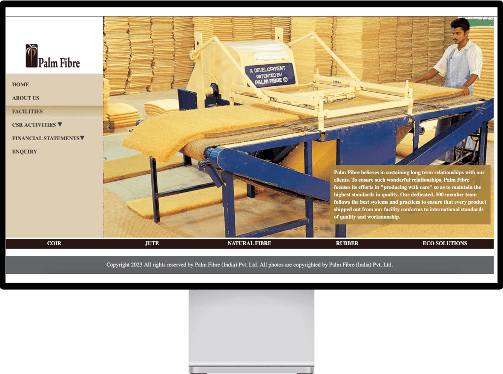
Menu Structure: The navigation menu is cluttered and does not follow a clear hierarchy. It lacks intuitive categorization, making it difficult for users to find what they need quickly.
Dropdown Indicators: The dropdown indicators for "CSR Activities" and "Financial Statements" are too subtle. They might be missed by users, leading to confusion about additional available options.
Crowded Information: The information is too crowded, particularly in the footer section where the copyright notice is placed. This makes the site look cluttered and unorganized.
Poor Use of Space: There is excessive whitespace in some areas, while others feel cramped. This imbalance distracts from the user experience.
Lack of Interactive Elements: There are no clear call-to-action buttons or interactive elements to engage users. The site feels static and uninviting.
Hover Effects: The lack of hover effects on menu items and links makes the site feel less interactive and user-friendly.
Desktop-Centric Design: The design seems to cater primarily to desktop users. There is no indication of how it adapts to mobile or tablet views, which is crucial in modern web design.
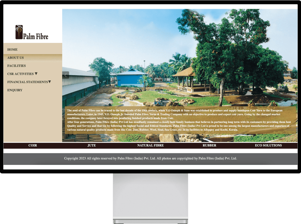
Inconsistent Imagery: The use of images is inconsistent. For example, the transition from a doormat to an industrial setting and then to an outdoor image creates visual dissonance.
Image Quality: The quality and resolution of the images vary, affecting the professional look of the site.
Font Choices: The font used for the menu and body text lacks readability and does not complement the brand's aesthetic. It's too small and blends with the background, causing strain.
Text Alignment: Text alignment is inconsistent, particularly in the body text overlays on images, which affects readability and overall design coherence.
Low Contrast: The beige and brown color scheme does not provide sufficient contrast, making text hard to read and buttons hard to distinguish. This affects accessibility for visually impaired users.
Lack of Brand Identity: The color palette does not effectively convey the brand's identity or message. It feels dated and uninviting.
Overlapping Text: In some images, the text overlays are not properly contrasted with the background, making them hard to read.
Generic Statements: The content includes generic statements about the company's mission and values, which do not engage the user or provide a unique selling proposition.
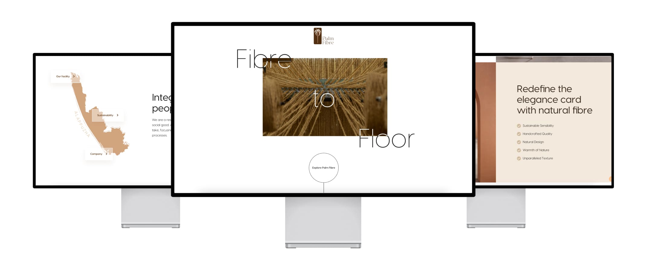
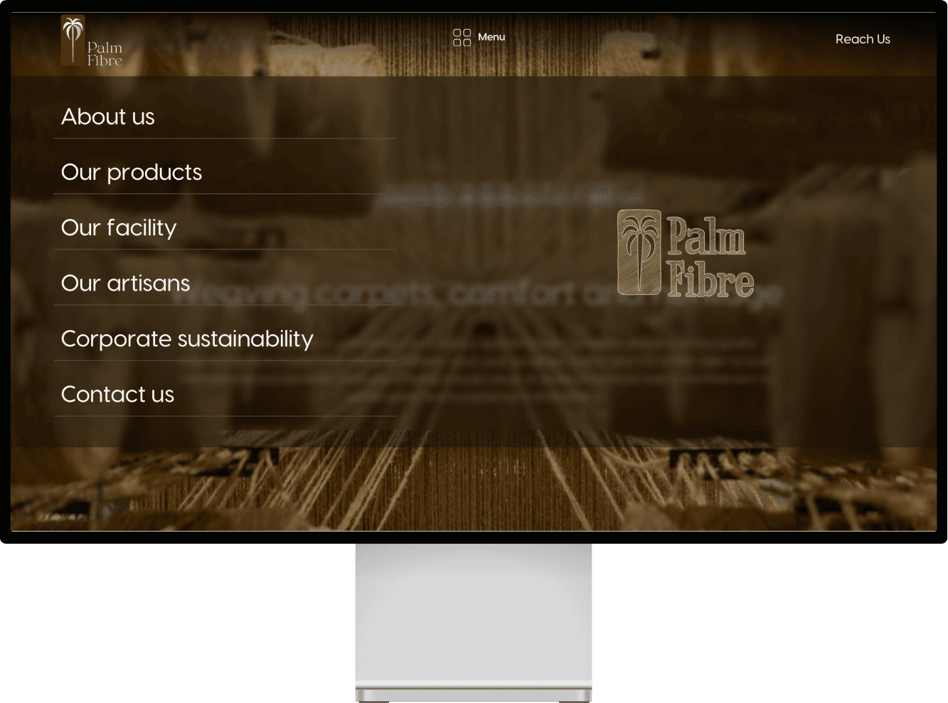
By redesigning the Palm Fibre website, we significantly improved the user experience and visual appeal, making it more intuitive and engaging for international clients. This revamp not only enhances brand perception but also facilitates smoother navigation and interaction, thereby supporting their growth as a leading exporter.
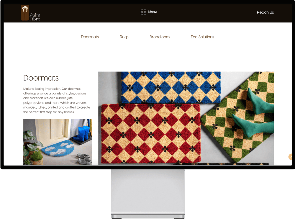
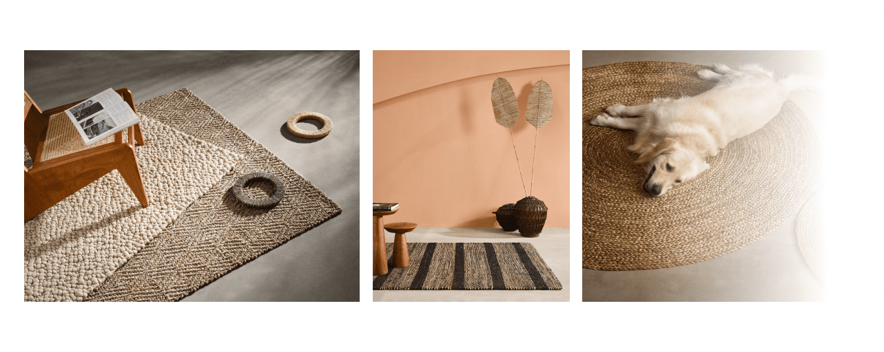
Explore photography we done for palm fibre to create a brand appearance and outlook. Their products looks amazing and very valuable, but showcasing it in a way that people get it's value and beauty easily through great photographs. Photography done using industry leading photography equipment Phase One for reaching a certain quality of showcasing the fine detail of each of their product
Our comprehensive redesign of the Palm Fibre website has transformed it into a more user-friendly, visually appealing, and professional platform. This enhancement not only aligns with modern web design standards but also effectively communicates Palm Fibre's commitment to quality and excellence. By improving navigation, aesthetics, and functionality, we have positioned Palm Fibre to better attract and engage international clients, reinforcing their stature as a leading exporter in the industry.
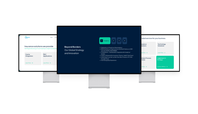
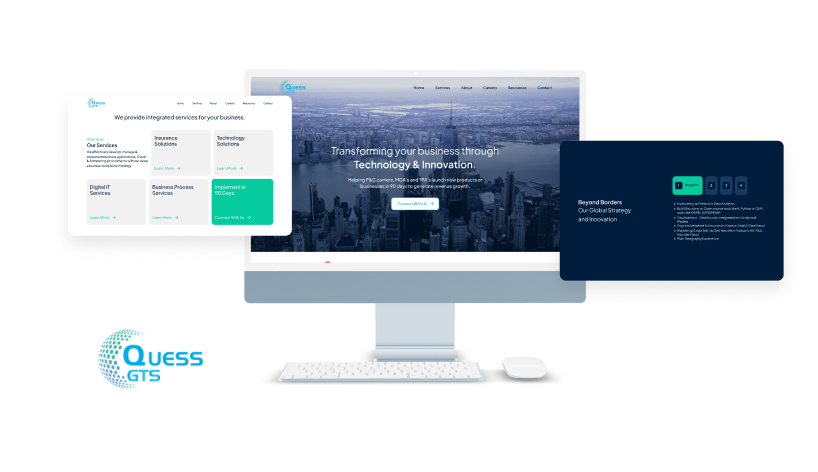
Full-service solutions to power your brand and technology, driving growth at every stage. Get started with us