 Revamping the website of a solar design and engineering partner
Case study
Solar Energy
EnergyScape Renewables is the operational backbone for solar installers, handling everything from sales proposals to PTO. Their previous website did not reflect that depth. Services were hidden, navigation was shallow, and the design and content felt generic, making it hard for installers to understand what EnergyScape offers.
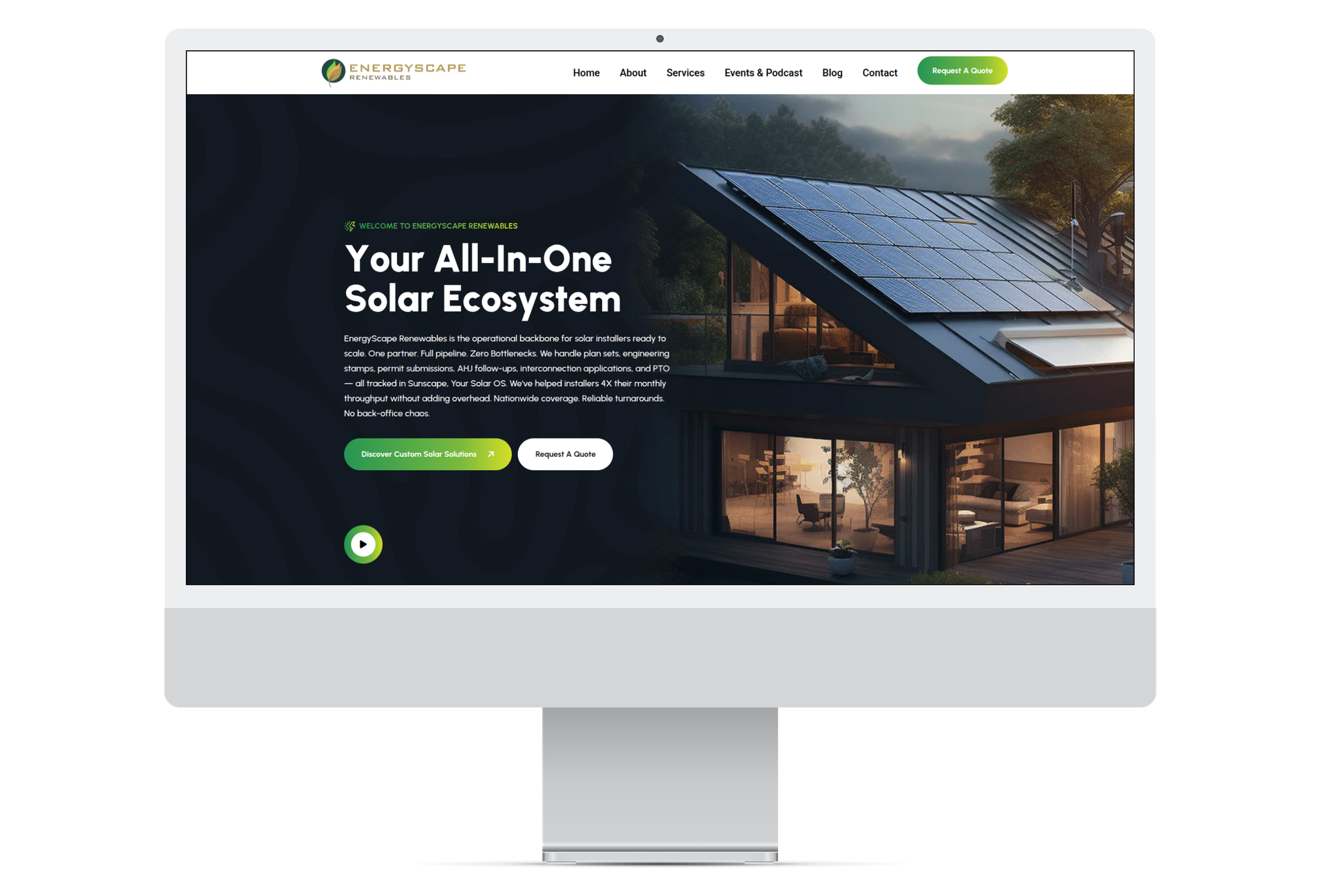
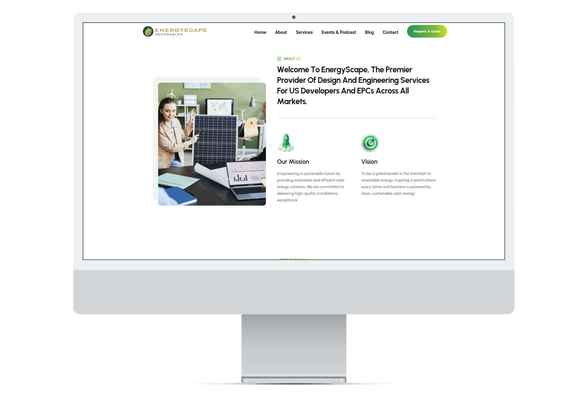
Flat Navigation: The menu (Home, About, Services, Events & Podcast, Blog) gives no view of what EnergyScape actually sells. Proposals, surveys, plan sets and permitting are all buried under a single “Services” link.
No Product Pages: Each service is a short card with a paragraph of text. There is no dedicated page explaining scope, turnaround or deliverables, so installers cannot evaluate a service before contacting sales.
Hard-to-Find Services: Services are only reachable by scrolling through a grid of cards. There is no single list showing the full pipeline from sale to switch-on.
Weak Calls to Action: “Request A Quote” is repeated everywhere but never tied to a specific service, so users are not guided to the next logical step.
No Audience Paths: Installers, EPCs and developers all land on the same generic pages with nothing tailored to their needs.

Dated Visual Style: The dark hero, gradient buttons and heavy display font feel like a generic template and do not reflect a precise engineering partner.
Inconsistent Imagery: Stock photos of offices and rooftops vary in tone and quality, weakening the brand's credibility.
Missing Icons and Hierarchy: Service cards have empty icon circles and uneven text lengths, which makes the layout look unfinished.
Generic Content: Copy such as “Your Solar Journey. Our Expertise. A Brighter Future.” and broad mission statements say little about turnaround times, coverage or results.
No Proof Points: Key numbers like installers supported, proposals delivered and first-attempt permit rates are absent, so the site fails to build trust.
We revamped the EnergyScape website from the ground up with a clear navigation structure, dedicated product pages, an easy-to-scan services list, a clean modern design and sharper content. The new site tells installers exactly what EnergyScape does, how fast it delivers and how to get started.
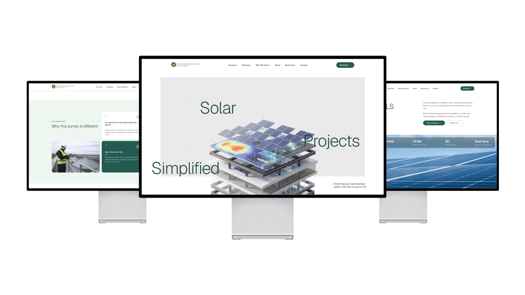
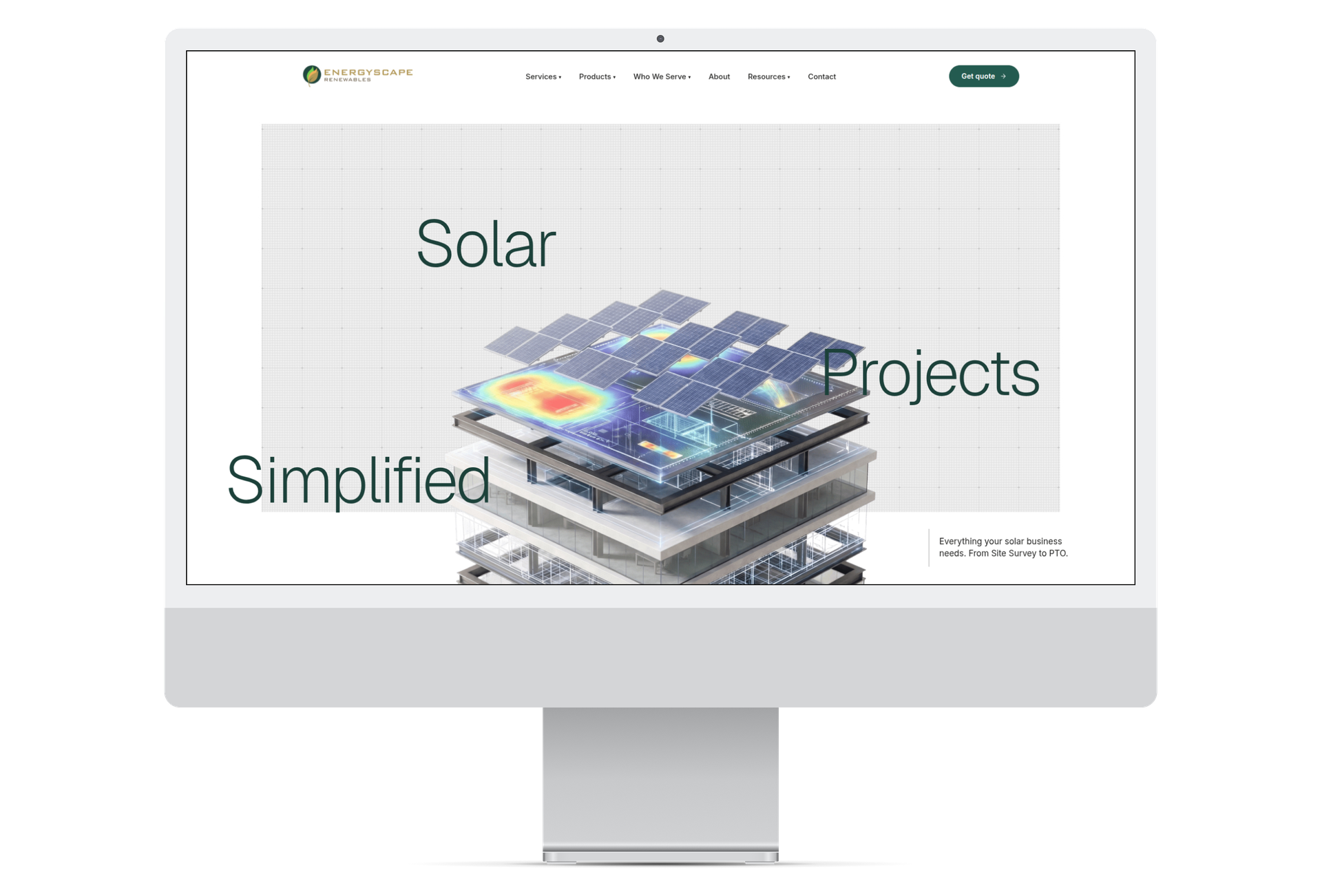
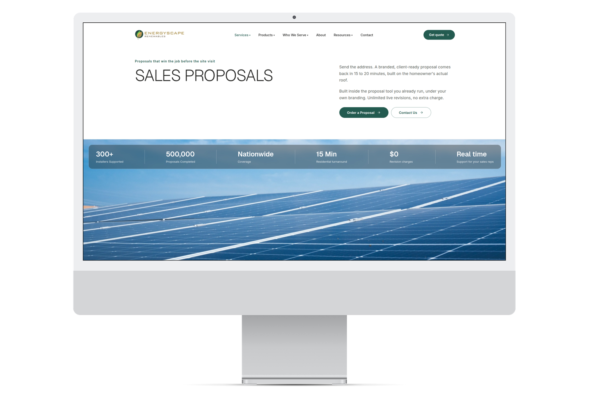
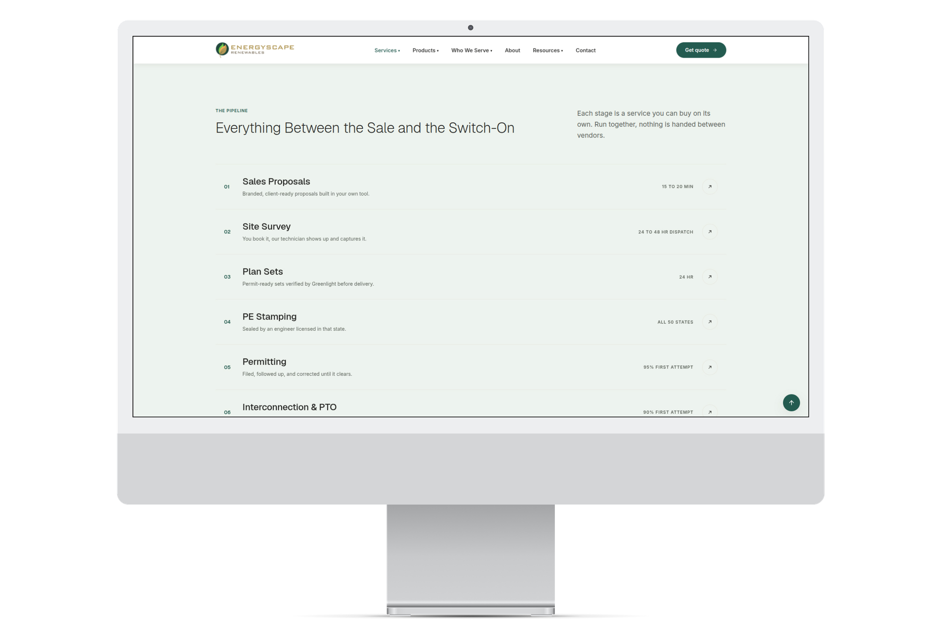

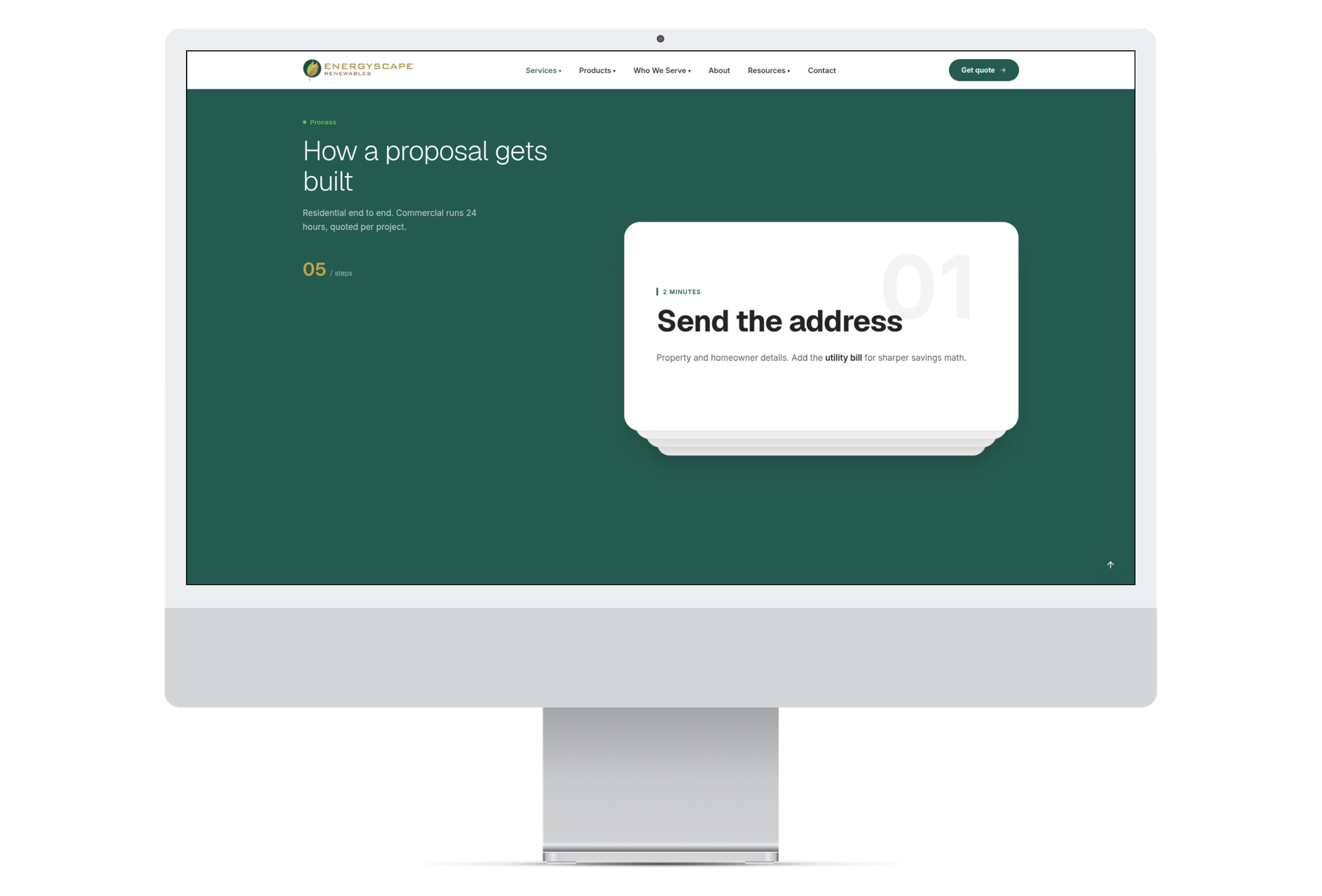
The revamped EnergyScape website now works as hard as their team does. Clear navigation, focused product pages and a complete services pipeline let installers find what they need in seconds, while the refreshed design and content communicate speed, precision and reliability. EnergyScape is now positioned as the all-in-one partner solar businesses can trust from site survey to PTO.
Full-service solutions to power your brand and technology, driving growth at every stage. Get started with us